Published on April 3, 2018
Few years back, as a part of my office work, I visited Infosys – Mysore campus. It was an experience of a lifetime to say the least. The campus, nicknamed “Heaven on Earth” or “A Paradise” is an epitome of the real infrastructure art.
 Mr. Narayana Murthy had described the training center, located 140 km off from India’s Silicon Valley, Bangluru, as the biggest corporate training facility in the world.
“We are setting up the biggest corporate training facility in the world with 2,000 rooms which can house 4,000 people on a twin sharing basis. As we would be hiring roughly 12,000 people on an average, if we train 4,000 employees for four months, we should be able to turn around three batches in a year at this center,” he said.
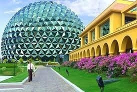
Frankly speaking, I was awed by the magnanimity and certain novel ideas like availability of cycles everywhere, landscaping and also the design of some of the buildings, especially the dome shaped 1500 seated multiplex (photographed above). But then, I was expecting something spectacular – why ? Infosys had money and requirement and they created a training center to meet their business needs.
No big deal…. In any case, they are from the IT industry and it is the new-age catering largely to Gen – Y. So what !!!
Another place I visited was Godrej – Vikhroli office. Now Godrej is a traditional manufacturing company and is over 120 years old. Before reaching their office, I obviously never expected something spectacular or new age. But then, I was in for a pleasant surprise…
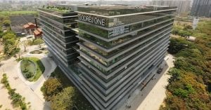 A former industrial site, Godrej One is 750,000 square feet of open, flexible spaces with world class amenities. It was way too refreshing and gave a meaningful impetus to my otherwise dull – diligence visit (I had gone there to check on SAP Success Factor working).
Godrej One also includes several amenities, including a Starbucks Coffee shop, a Nature’s Basket store (Godrej owned), a BBlunt hair salon. An onsite Creche and a Gym…
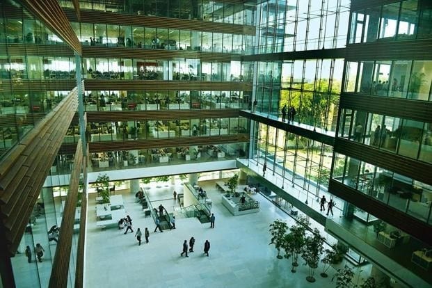
Besides, they have an expansive 10,850 sq. ft. atrium that has cluster of trees which help to bring outdoors inside. The atrium is designed in such a way that every employee has to go through it to get to their office.
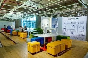
Despite its large size, no employee is seated more that 25 ft. away from a window, which also reduces electricity consumption.
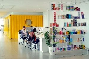 The building also boasts of large terraces on floor 4, 7 and 10. A roof garden also open to all ensures a well desired insula- tor from any heat gain. The planted terraces and deep shading over-hangs were arranged according to solar orientation of the building. The design carefully limits direct sunlight onto the glass façade to reduce heat gain while allowing indirect and northern light deep into the work spaces to decrease the need for artificial lighting.
But the big question is…
Why would a company invest so much in creating a work place that is visually appealing? Is it worth the money???
Consider a 2007 study, wherein 100 Rice university students were asked to take a test of Abstract thinking – a precursor to Creativity… Half of the students were seated in a hall that had 10 feet ceiling and another half took the test in an identical hall that had 8 feet ceiling.
Now it is not a brainer that a person would feel claustrophobic in an elevator as compared to a high ceiling hall… but a mere difference of two feet… is it going to have any considerable difference.
To ensure students do notice the hall’s height, the researchers attached decorative lanterns to the ceiling. They then randomly assigned students to the halls, without mentioning anything about the variation in height.
The results were striking – the participants in the hall with higher ceiling were significantly better in finding connections with seemingly unrelated objects than those whose ceiling was lower.
The room’s dimensions had inspired big thoughts.
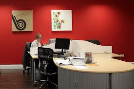 Height is just one of the important elements of office design. Take colour for example – Red… what does colour red mean to us. Stop, Danger, Alarm, Blood… Research shows that brief exposure to colour red makes us more vigilant, alert & also sensitive to failures. Now it depending upon the situation – red colour can harm or benefit. A study found that proof-readers find more errors while using red coloured pens. Another study published in Science suggests that people exposed to red are good at tasks that require accuracy or detailing – but they are not too great at being creative or big picture thinking.
As per http://www.openworkspacedesign.co.uk/2016/04/12/how-to-use-colour-in-office-design/ employees are most productive in offices that have predominantly blue colour schemes. Blue has a calming effect on humans and has been proven to reduce stress by lowering blood pressure and heart rate. So, in an office where deadlines are carved on stone – it’s better to have a blue colour scheme. Besides, blue also promotes communication, trust and efficiency between colleagues and helps in being creative….
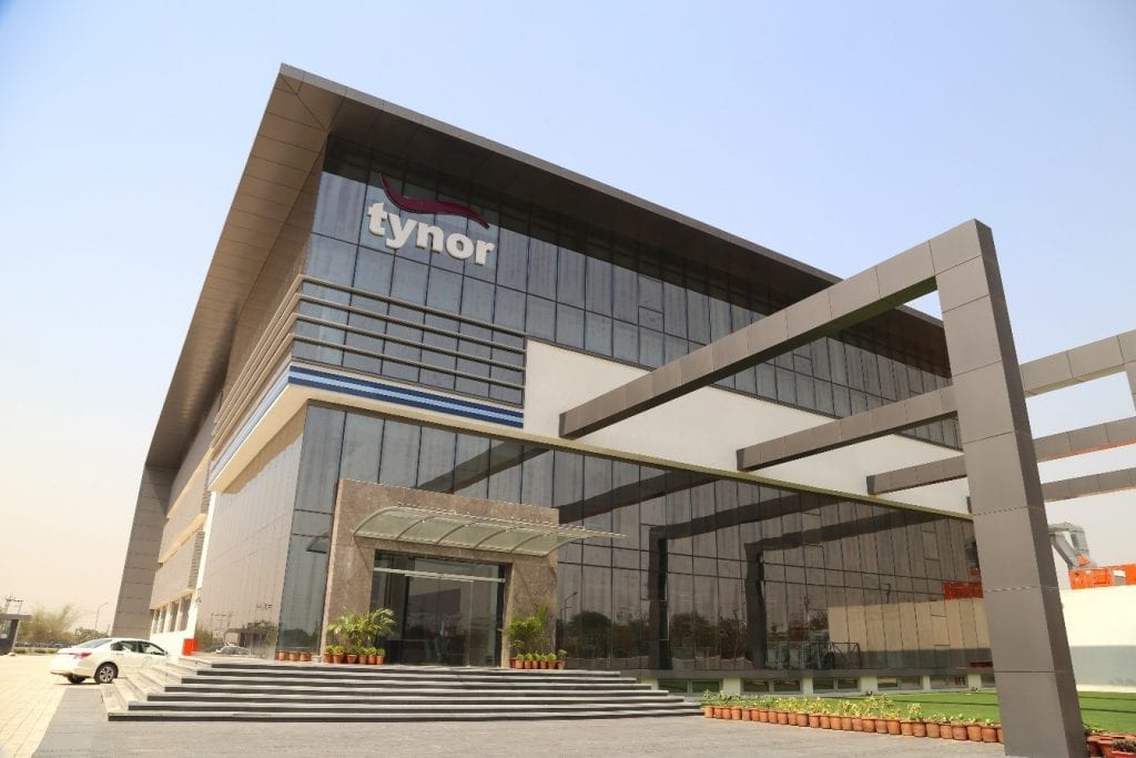
The third office, I would like to mention about is Tynor in Mohali, Chandigarh. They are doing great work in the field of orthopaedic aids. First thing that catches your attention, the moment you enter their plant cum corporate office in Sector 82, Mohali is a badminton court. When you enter their office, you are greeted by a nice cafeteria.
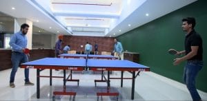 Tynor also has a well-equipped gymnasium that is often packed to capacity after office hours.
Besides, it has a snooker table and other indoor games. They have used variety of colours & shapes to break the monotony.
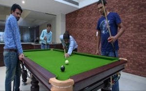 Now, what does a company in Chandigarh have to gain by providing all these facilities that are uncommon in this part of the country. And, they could have conveniently avoided using the expensive real estate for putting couple of more machines.
When I asked Dr P J Singh, Managing Director of Tynor, as to what impact these amenities had on the morale of employees – he responded with a chuckle in his voice; “The attrition has gone down and employees now look at Tynor as a final destination”. Moreover, he adds – “they are more committed and work harder”. Maybe it’s their way to reciprocate.
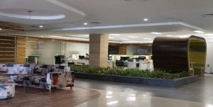 When I asked him about the arch shaped waiting area, he had an interesting thing to share. He said the visitors get an inviting and welcome feeling and the shape also helps in lifting their spirits & obviously the image of the company in their mind.
 They do have a very colorful décor to give a feeling of agility and youthfulness. Not surprisingly they are creating records with their overall performance.
Nisaba Godrej, Executive Director of Godrej Consumer Products, had a different take. She spoke to “Live Mint”, sometime back and to quote: “It was important that the building enable collaboration between different teams and companies, since it’s a critical aspect of organizational capital”. Organizational Capital is the Culture, Structure and processes.
A 2006 study revealed that the pleasure centres of the brain consistently lighten up by viewing landscapes. Another insight is that we are happiest when we are close to the outdoors. A 2003 study of call centre employees who frequently rotated seats found that those employees who were seated near a window were able to generate an additional $ 3000 revenue per year!!! Besides employees who sit near a window are better at being loyal to the company, are focussed and show greater interest in their work.
An interesting study conducted in 2013 revealed that those employees whose offices have windows sleep forty-six minutes more per night on average as compared to those who did not have windows.
With all the data that researches have shown – it is abundantly clear that office décor has a profound impact on the employee engagement and productivity. More over those firms who are willing to go that extra mile to satisfy the creative pangs of their employees are doing whatever it takes to create a happening work place.
One such example is creating “Noise”. Yes, you heard it right – Noise, the research proves is not always bad. In-fact, Oxford University in a research published in 2012, gave conclusive evidence that moderate level of noise not only led to higher creative output but also enhance people’s adoption of innovative products.
It’s therefore no wonder that websites like http://coffitivity.com recreate the low hum of a café, which researchers suggest can provide a creative boost. Similarly, http://simplynoise.com offers sounds of rain and other noises to help you mask constant distractions when you need to concentrate.
Some of the organisations have started providing a small budget to their employees for decorating their work stations.
So next time there is an opportunity to either renovate or build a new office – keep your creative juices to the full and involve the employees to help you create magic for yourself and for them.
